Friday, March 6, 2009

Composition and perspective

Today, I'll show how to paint the picture from the begining. Trochę o szkicu, kompozycji i wreszcie o perspektywie. A bit of a sketch,composition and finally about perspective.

I started from a small thumbnail sketch on a piece of paper. At this point, only I know what it represents :) I did it on the basis of a photo found on the Internet representing the interior of the country house. I made several sketches and I found interestingone of them land it also inspired for new ideas, so I started to transfer it to a larger format.


I prepered 35cmx50cm paper planning to draw a delicate contours and paint watercolors. In the meantime, I had various ideas which I put on the paper. After some time the paper was realy dirty soI decided to create a more accurate drawing which then I would transfer to a new paper and paint watercolors. I started drawing more loosely, wipe, improve. Such a study is useful for determining darkest and brightest spots. Here I am not sure yet what to put in the foreground - a table, a dog, a rug?


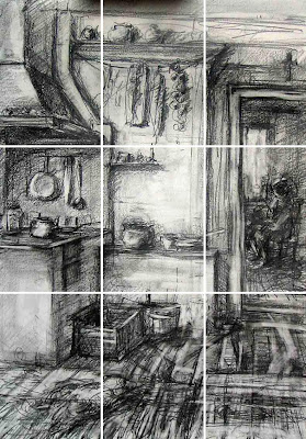
Now, I will explain why I'm doing this that way and not otherwise. I used the classical division rule - three equal parts. I tried to put importent elements on the main lines and preferably at the intersection of these lines. Here, the composition is in the process of setting so I see now that I have to move and add more elements.


The image must be a story. The elements should guide the eye from place to place. The viewer has a tendency to "read" picture like a book so I start from the left side where I probably put a dog. The lines will direct the eye to the right to a person sitting in the other room, then fly around and read out the situation that she is likely to live in the country, she is resting now or something like that. Anyone can of course interpret my image in a completely different way, I do not care:)


Here I show how to set a horizontal line of the horizon. Now it is at the height of the eyes of the person sitting in the background, it means that may eyes ere at this height too - so I'm sitting. Crossing the lines is the intersection point and better when it is moved to the side - not on the center.


One point perspective that is shown here is as simplest because as the name suggests - there is only one point where go all lines parallel with our eyes. It is used as when we look straight at the wall. All lines perpendicular to the wall meet at one fixed point. Horizontal line is very important, because all the lines above it step down and all the lines below it go to the top. It's easy to make mistakes forgetting about it.


The lines on the wall and parallel to it are like on a technical drawing. The points of intersection of these lines produce 3D ilusion of the image. For now, I will not be inquired into the details of geometry. At the beginning to feeling a bit - the farthe the smaller and the best is to draw from nature holding pencil in hand.

I showed here the way in which I start painting larger formats in more realistic way with the proper perspective. Such drawing can be then transferred to paper or underpaintings with different ways- using a grid, the backlight - depending on the situation.
I often paint without such detailed drawings - I use expression, improvise, I sketch landscapes lightly selecting the most important points. Watercolors are more lively and light this way.

Wednesday, March 4, 2009

The simple harmony of colors

Today, I'd like to show the harmony of colors which are yellow and blue, plus a third color similar to one of them.

Geranium 21cmx30cm (8"x12") - I used yellow, cobalt, and ultramarine in the shadows . Cobalt is a bright pigment and in conjunction with other gives grays but doesn't make it darker.


St. Roch Church in Białystok (21x30) - I did an experiment here. First, with a black watercolor pencil I painted whole picture in a mochromatic way. I didn't draw with it but put it on a piece of paper and using damp brush painted with it as with a regular watercolor. Watercolor pencil after drying does not dissolve as usual watercolor so after it dried I could impose other colors. I painted yellow lights and blue shadows. Green was created by mixing these colors in different proportions, but I added also an olive green. Finally, on the damp paper I darew some black marks with watercolor pencil.


Large Watercolor 33cmx48cm (13"x19") - I used lemon yellow, prussian blue, indigo, and a few orange spots on plants at the window. Watercolor was painted in three layers, each darkening another one in place that seemed to me to be too bright. I used the razor blade and sandpaper to obtain white accents.

The examples above show a rather simple but good color harmony. There are two colors which one is a dominant color, the third nearly one of them (blue plus yellow and orange, yellow and blue plus cobalt, blue, plus yellow and green).


At the end something totally different. Portrait of a girl I recently drew. In addition to the regular drawing with 2B pencil I used graphite powder. In this way, great smooth transition is achieved, the delicate skin and foggy background.

Wednesday, February 18, 2009

Preparation paper for watercolor painting

This film describes how to prepar paper for watercolor painting. You can watch the video and description of the various stages below.


For a few days I had trouble starting the presentation. Here I give some explanations in traditional form.

Sometimes I do the drawing first - before I stick paper to the board. when I don't have the mood and make mistakes I just take a new card and do not have to detach it. It is hard to wipe off pencil if its overdrawed end watercolor go dirty. It is better that the picture was as delicate. This order is not necessary but possible, and who will.


Next I tear off pieces of the tape. Touching tape with wet hands is gluing the reel.


I am filling the bath with water and dip my sheet for 5 - 10 minutes. Paper has to get wet and soft but dissolves the glue which is a component of paper, so it is not advisable to soak it too long.


I gently remove paper from water. It is soft now so I let water drip for a moment.


I put paper on a towel and gently let the water soak in it After a while the paper is damp but not wet, it is not shinnig.


Now, I'm moisturizing previously prepared pieces with the wet sponge and tape the paper, clamp it firmly. If the tape is badly affixed to the paper it will bend.


Now I leave the paper for the night to dry. On the next day I start to paint. This is my method that I like to work that way. I often prepar few sheets of clean paper or with sketches and I have a spare ready to paint. I use plywood as a drawing board. In some areas, tape did not want to keep.
When my painting is done and dry it must be cutted off so the size of paper that I prepared at the beginning declines. I soak the tape which is left on the board and scrape it off with spatula.

Saturday, February 7, 2009

Basic watercolor techniques

Today I introduce the basic watercolor techniques and show how to paint simple, pretty picture. The best topics at the beginning are flowers, landscapes or fruits because they do not require proficiency in the use of perspective. The best way to start is the single color paint to focus on the technique.
First I carried out a pencil sketch on paper 15x20cm (6"x9"). If I need a precise drawing I usie 2B pencil , if the sketch is to be less precise I usually use 3B. Harder pencils are more difficult to wipe. If I intend to soak the paper and stretch it to the board in spite of everything I can to draw everything in pencil first, the water does not harm him.


Now, I covered the paper with the clean water which has rapidly soaked in so I dumped it again. It is a "wet in wet" technique. Paper must be still shiny from the water. On the wet surface of the stain of paint can be corrected, lighten, darken etc. If I use paint with a high use of water iit will be clear and giddy. The more dry brush is and lesspaints on it stain becomes darker and more accurate but still foggy. Excellent technique for painting the background, sky, far-off plans.


When the paper dried up completely I painted a second layer. I paint here "normally" on a dry surface using a large amount of water. Used here is "negative painting". The shape was created by the dimness of flowers around the area and not painted by the same color. The second effect which is applied here is called "found and lost". The stems have sharp edges, but they flow away in some places. This is done for example by washing wet spots with clean water in some often accidenital places or by using two brushes at once - one with paint and a second with clear of water or other methods of ypur own. Very nice effect, my favorite.


Here I present two another techniques. The first one is to obtain the white. I use wet brush to lift the paint off, rinse the brush, wipe in dry paper towel and remove the paint again. I don't obtain a perfect white this way but rather strongly lighten it. I use the flat edge of brush to get thin lines. This way I lightened some stalks and lines on leaves . There are also presented next flayer here- "calligraphy". It recalls and a drawing so it is different from previous techniques. I use a thin "rigger" and paint lines with more detail and less amount of water to paint darker line.


Here I use technique known as "dry brush". Paint comes mostly out of the tube. I get through this very dark and thin line and needed to details. In other places a dry brush lets to get interesting rough surface so the stems and leaves look as more extended to the first plan.


Finally, I put yellow paint here and there. It sometimes stays yellow and sometimes give me igreen in combination with indigo blue. The rule in watercolor is painting bright spots first and then darker so theoretically I should not do this ... but who shall prohibit me? : D: D: D

Tuesday, February 3, 2009

Barwy dopełniające

Po dłuższej przerwie znów będę pisał o kolorach, tym razem o kolorach dopełniających.
Kolory żółty i fioletowy są kolorami dopełniającymi, gdyż leżą po przeciwnych stronach koła barw. Jeżeli znajdują się obok siebie tworzą silne kontrasty. Musi być jednak zachowana duża różnica walorów - jeden kolor musi być bardzo jasny drugi ciemny.


Dobór odpowiedniego koloru dopełniającego jest czasem pewnym problemem. Teoretycznie po zmieszaniu powinna powstać czerń. Pigmenty nie są jednak czystki barwami, jest kilka niebieskich, a w dodatku różnią się w zależności od producenta.


Drugim celem użycia barw dopełniających jest uzyskanie kolorów złamanych. Tu w niektórych partiach obrazka kolory się mieszają i uzyskując złamany odcień. Dodatkowo przykład posypania solą mokrej farby - powstaje ciekawy efekt.


Niebieski i pomarańczowy to kolory dopełniające, tu namalowane dla uzyskania kontrastu.


Tu kolory się mieszają w środkowej partii obrazka stając się bardziej szare lub brązowawe. Jest to metoda uzyskania głębi w pejzażu. Pierwszy plan prawie czystymi kolorami, a im dalej tym bardziej złamane i niewyraźne.


Ten obrazek został namalowany wyłącznie złamanym niebieskim i pomarańczowym. Tu łatwo przesadzić i wpaść w pułapkę szarości.


Zieleń i czerwień czyli maki na łące. W tym wypadku należy pamiętać aby zróżnicować walor jednej z barw. Zieleń i czerwień często mają ten sam walor.


Złamana zieleń wygląda bardziej naturalnie, zawsze maluję ją dodając nieco czerwieni.

Friday, January 9, 2009

Kolory wtórne trzeciego stopnia

Zielony, fioletowy i pomarańczowy to kolory wtórne czyli drugiego stopnia ale dzieląc dalej koło barw dochodzimy do trzeciego stopnia.
Niebieskie niebo i żółta trawa czyli kolory podstawowe dają zieleń (drzewo w środku). Jak widać jest jeszcze miejsce na zielonożółte drzewo z przodu i zielononiebieskie z tyłu.


Analogicznie czerwone dachy i żółta ziemia (podstawowe), pomarańczowy budynek w środku (wtórne) a po bokach budynki czerwonopomarańczowy i żółtopomarańczowy (wtórne trzeciego stopnia).


Wreszcie od niebieskiego przez niebieskofioletowy, filetowy, czerwonofioletowy do czerwonego.


Z kolorów wtórnych trzeciego stopnia można utworzyć dwie harmoniczne triady. Idąc w jedną stronę od podstawowych barw w kole znajdziemy niebieskofioletowy, żółtozielony i czerwonopomarańczowy.


Idąc w drugą stronę znajdziemy czerwonofioletowy, żółtopomarańczowy i niebieskozielony.


Podane przykłady wyglądają infantylnie gdyż są tylko prostą prezentacją do zapamiętania z których barw składa się dana gama harmoniczna. W praktyce kolory wchodzące w skład gamy nie zabraniają występowania innych kolorów tylko przeważają nad innymi i nadają ogólny koloryt obrazu oraz jedna z barw powinna być wyraźniejszą dominantą. Zaprezentuję to w następnych wpisach.

Kolory wtórne

Kolory wtórne powstają przez zmieszanie dwóch kolorów podstawowych.
Jeśli zmieszamy odcienie znajdujące się bliżej siebie na kole kolorów to powstałe będą bardziej czyste. Tu zmieszałem błękit pruski z żółcią cytrynową. Obydwa pigmenty mają zielonkawy odcień.


Tu natomiast żółty z ultramaryną która ma więcej w sobie czerwieni. Powstała zieleń jest bardziej przybrudzona.


Żółty z ciepłą czerwienią daje czysty pomarańczowy.


Żółty cytrynowy z kraplakiem daje złamany, przybrudzony odcień pomarańczowego.


Konsekwentnie ultramaryna zmieszana z kraplakiem dają fiolet.


Błękit pruski z czerwienią brudzą fiolet ale pozwalają uzyskać fajną czerń.


Do namalowania tego obrazka użyłem wyłącznie farby żółtej, niebieskiej i czerwonej które mieszałem na palecie. W rezultacie otrzymałem obrazek w harmonii kolorów wtórnych.


Podsumowując jeśli chcemy uzyskać czyste barwy wtórne powinniśmy wybrać odcienie kolorów podstawowych które leżą bliżej siebie na kole. Jeśli chcemy złamać kolory i mieć odcień szarawy lub brązowawy to możemy użyć innych. Przydaje się to często podczas malowania zieleni. Drzewa, trawy etc. nie mają jednolitej barwy i jeśli się użyje różnych mieszanek to wyglądają naturalniej.

Thursday, January 8, 2009

Kolory podstawowe

Kolejną gamą barw po prostu kolory podstawowe. Chyba każdy wie ze szkoły, że kolory podstawowe to żółty, niebieski i czerwony.
To przykład namalowany żółtym, czerwonym i niebieskim. Czyste kolory obok siebie wyglądają dziecinnie i są często używane przy projektowaniu zabawek lub mebelków, pokoi, książek dla dzieci.


W drukarstwie stosuje się jednak bardziej precyzyjnego podziału na tzw. triadę czyli żółty, cyjan i purpurę. Demonstruję tu żółty, błękit pruski i kraplak które są zbliżone do kolorów triady.


W praktyce jeśli pozwolimy kolorom się trochę zlewać i tworzyć przejścia to namalujemy ładny, kolorowy obrazek używając wyłącznie trzech kolorów podstawowych chociaż nie będą to już same czyste kolory.


Jeśli zmieszamy trzy kolory to powstaną brązy. Zgaszą one soczystość czystych barw. Lepiej tego unikać jeśli obrazek ma być kolorowy i słneczny.


Gama harmoniczna kolorów podstawowych stosuje się najczęściej w projektowaniu znaków graficznych, ornamentów, malarstwie abstrakcyjnym lub innych gatunkach jak np. pop-art. Żółty, cyjan i purpura to rzeczywiste kolory podstawowe jednak w malarstwie dalej stosuje się tradycyjny podział na żółty, niebieski i czerwony.

Wednesday, January 7, 2009

Zima w Białymstoku

Pojawiła się rewelacyjna szadź więc poszedłem z aparatem do parku. Poniżej przedstawiam krok po kroku etapy w jakich powstawała jedna z moich ostatnich akwarel. Zdjęcie każdego etapu oznacza że w tym czasie musiałem czekać aż wyschnie warstwa farby.

Najpierw jak wspominałem zrobiłem zdjęcie.

Na podstawie zdjęcia zrobiłem szkic ołówkiem na papierze 20x30. Jak widać nie trzymam się dokładnie fotografii tylko wykorzystuję ją do własnej kompozycji.

Zamalowałem niebo ultramaryną a w miejscach słonecznych żółto-pomarańczowym odcieniem, czasem żółtą ochrą.

Ultramaryną mieszaną w różnych proporcjach z umbrą paloną i żółtą ochrą namalowałem cienie na śniegu oraz zarys drzew.

Tu domalowałem pnie drzew pozwalając im się rozmyć ku górze. Używałem umbry palonej z niewielką ilością ultramaryny i brązu van Dycka.

Do namalowania zieleni w centrum użyłem sieny palonej z ultramaryną.

Tu przyciemniłem cienie na pierwszym planie używając czystej ultramaryny czasem z dodatkiem umbry palonej.


Teraz zacząłem malować pierwszy plan - drzewa i krzewy różnymi brązami z dodatkiem ultramaryny.
W końcu ostrzem żyletki wydrapałem śnieg na gałęziach a oraz zrobiłem szadź.

Przedstawiłem tu jedną z metod uzyskiwania białych plam w akwareli. Pierszą jest zwykłe pozostawienie niezamalowanych miejsc. Inną metodą jest pokrycie fragmentów płynem maskującym. Dziś pokazałem wydrapywanie. Można do tego użyć żyletki lub papieru ściernego. Najważniejsze aby farba była całkowicie sucha. Są jeszcze inne metody ale o tym w następnych wpisach.